Plotting epistatic coefficients
epistasis.pyplot is an optional matplotlib-backed subpackage. Install via:
Importing epistasis.pyplot without matplotlib installed raises a clear ImportError.
plot_coefs
plot_coefs reproduces the signature figure from the original epistasis package: a
bar chart of fitted coefficients colored by interaction order, with a grid underneath
marking which sites participate in each term.
import numpy as np
from epistasis.models.linear import EpistasisLinearRegression
from epistasis.pyplot import plot_coefs
from epistasis.simulate import simulate_random_linear_gpm

gpm, _, _ = simulate_random_linear_gpm(
    wildtype="AAAAA",
    mutations={i: ["A", "T"] for i in range(5)},
    order=3,
    rng=np.random.default_rng(0),
)
model = EpistasisLinearRegression(order=3).add_gpm(gpm).fit()

fig, (bar_axis, grid_axis) = plot_coefs(model)
fig.savefig("coefs.png", dpi=200, bbox_inches="tight")
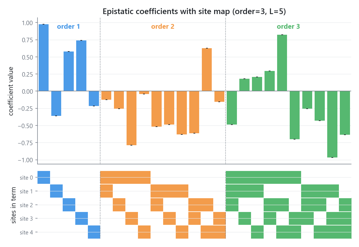
Reading the figure:
- Each bar is one epistatic coefficient. Bars are colored by interaction order (order 1, order 2, ...). The intercept term is dropped.
- Vertical dotted lines separate the orders, and each block is labeled.
- The grid underneath has one row per site and one column per coefficient. A cell is filled (in that term's order color) when the site participates in the term. The order-1 block is the diagonal; higher orders show the combinatorial structure.
Without a model
Pass coefficients directly with sites= and values=. sites is a sequence of
1-indexed site tuples; the intercept is (0,) and is dropped automatically.
from epistasis.pyplot import plot_coefs

sites = [(1,), (2,), (3,), (1, 2), (1, 3), (2, 3)]
values = [0.5, -0.3, 0.8, 0.2, -0.1, 0.15]
fig, axes = plot_coefs(sites=sites, values=values)
Significance shading and stars
When sigmas > 0 and standard errors are available (e.g. from an OLS fit),
plot_coefs draws error bars, greys out terms that are not significant, and stacks
* markers per star_cutoffs threshold crossed. Significance uses Bonferroni-corrected
p-values by default (significance="bon"; use "p" for raw, or None to disable).
Customizing
| Parameter | Default | Notes |
|---|---|---|
order_colors |
DEFAULT_ORDER_COLORS |
Colors indexed by order; index 0 is the intercept / insignificant color |
xgrid |
True |
Draw the site-participation grid panel |
height_ratio |
3.0 |
Bar-panel height relative to the grid panel |
figsize |
(8.0, 5.0) |
Used only when ax is not supplied |
y_axis_name |
"coefficient value" |
Bar-panel y-axis label |
ax |
None |
Draw into existing axes: [bar_axis, grid_axis], or [bar_axis] when xgrid=False |
The grid cell borders pick up the active matplotlib theme's grid.color, so the figure
adapts to light and dark styles automatically.
plot_correlation
The second classic diagnostic: observed against model-predicted phenotype, around the 1:1 line, annotated with the coefficient of determination.
from epistasis.pyplot import plot_correlation

fig, ax = plot_correlation(model)   # R^2 from model.score()
Or pass arrays directly (R^2 is then computed from them):
Saving figures
fig is a plain matplotlib Figure:
See the pyplot reference for the full signatures.